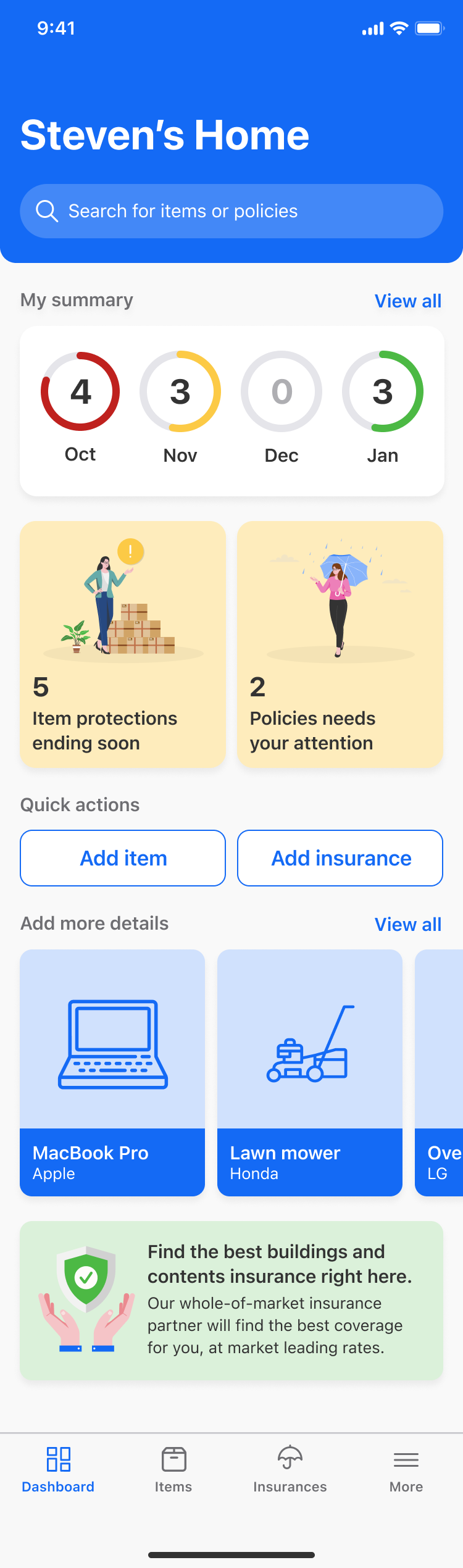
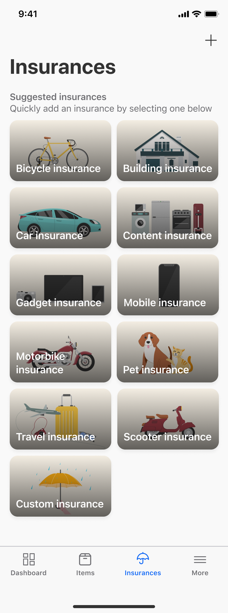
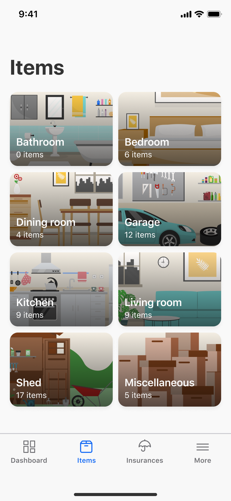
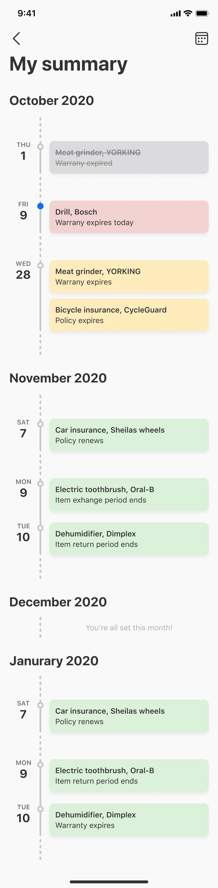
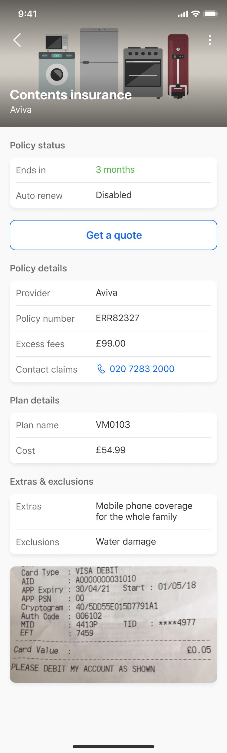
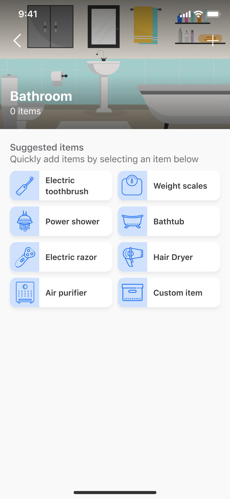
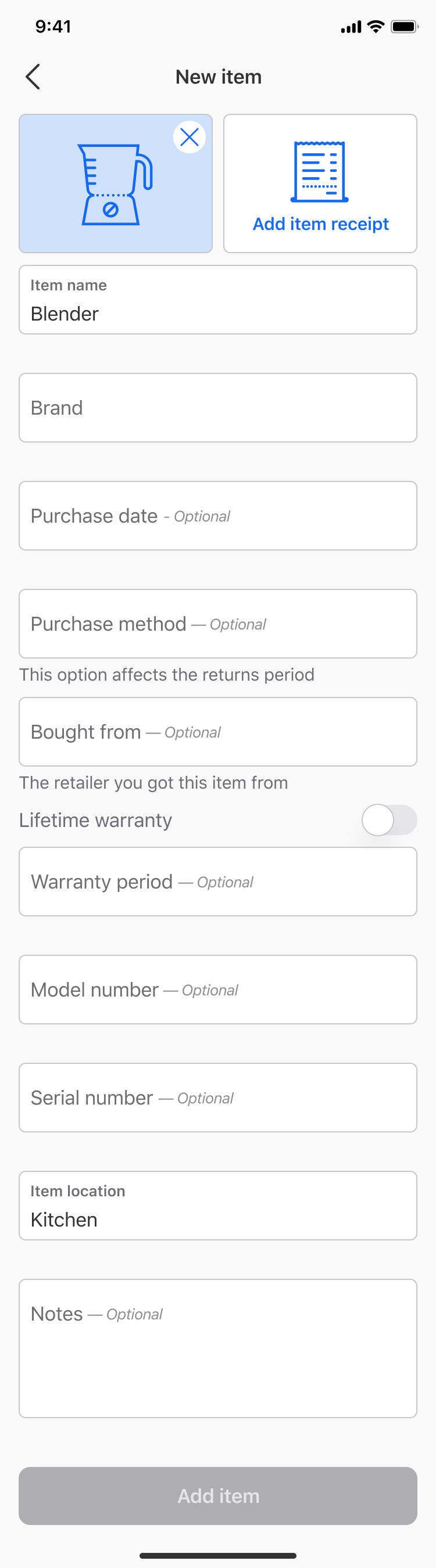
Covvered is a B2C platform that reminds users when their purchases and insurances protections are expiring, allowing the user to save time and money by having all the documentation to hand when they need it.
The Covvered mobile platform was initially built in 2019 using a hybrid mobile development approach. This enabled the idea to be validated by the market whilst also spawning new feature ideas and improvements. The Covvered platform underwent a complete rebuild in 2020/2021 to create native mobile applications that used OS design patterns and a more robust backend API service that would better serve upcoming features on the roadmap.
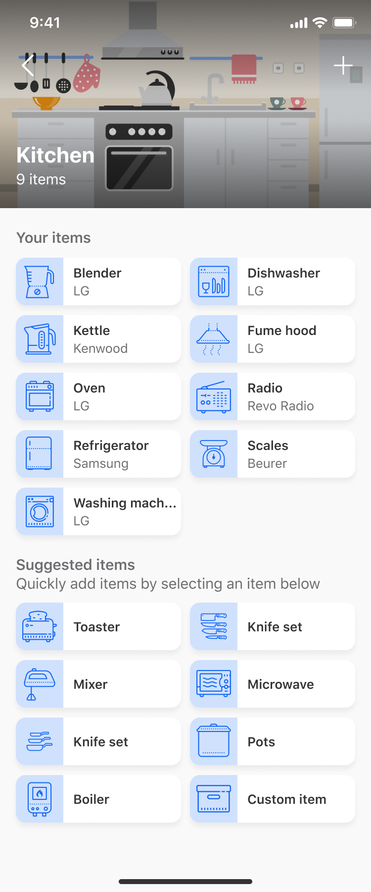
The stakeholders wanted to keep the same user journeys in the app that were already validated by the analytics. I researched competitor’s apps and adjacencies to identify good design systems. I created a mood board, including some app’s from different sectors that have performed well.
I decided to use Figma to design the app because of it’s inbuilt prototyping capabilities, unparalleled component tools and text and colour pallet handling. This was my first time using Figma and I found the tool very easy to use, having previously used similar tools like Sketch and XD.
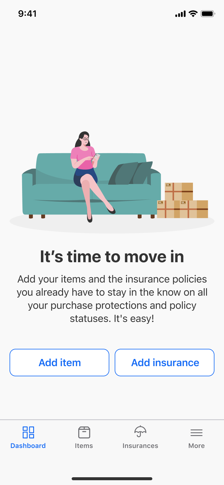
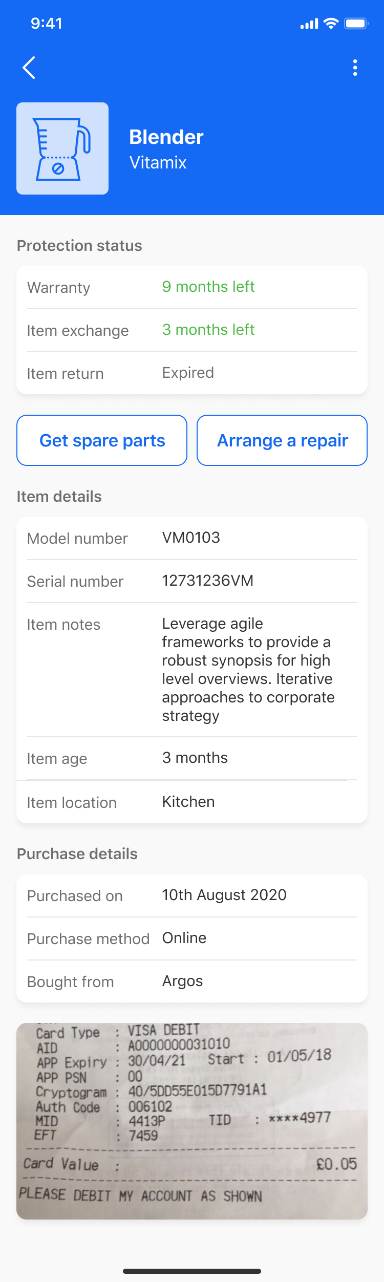
I started by designing key app journeys in low fidelity and slowly refining them. From this process a design system of different components was slowly brought to life. After some internal reviews I the app was ready for testing.
I used a testing group of 10 users who were never exposed to Covvered before. I created the prototype on Figma and linked it up to Usebery so I could gather analytical data. The test consisted of some tasks followed by System Usability Scale (SUS) questions. The average SUS score of 68 rated the design as “Good”. The heatmaps and recordings of user journeys highlighted areas of the design that needed improvement.